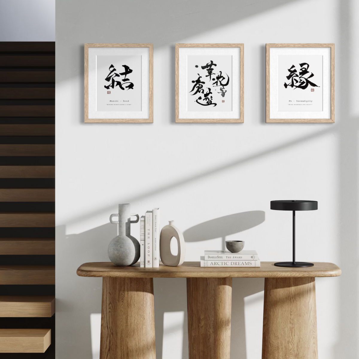
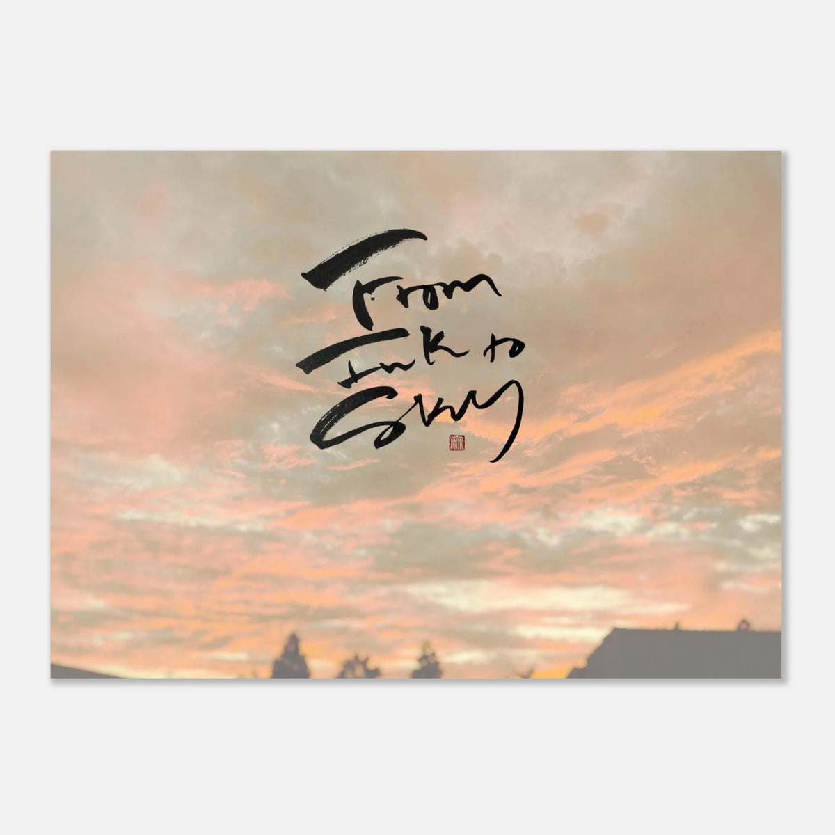
How to Create a Japandi Gallery Wall with Calligraphy
A Japandi gallery wall is not about filling space — it is about creating quiet visual balance. By combining Japanese minimalism with Scandinavian warmth, Japandi styling transforms a simple wall into a calm, intentional focal point.
When thoughtfully composed, Japanese calligraphy becomes the perfect anchor for a Japandi gallery wall, adding meaning, movement, and cultural depth without visual clutter.
This guide walks you step-by-step through creating a refined Japandi gallery wall using calligraphy art.
What Defines a Japandi Gallery Wall?
Unlike traditional gallery walls that can feel busy or eclectic, Japandi compositions follow a more restrained philosophy.
A true Japandi gallery wall emphasizes:
- generous negative space
- neutral, cohesive tones
- natural materials
- asymmetrical balance
- meaningful focal artwork
The goal is calm cohesion — not visual density.
Step 1: Start With a Strong Calligraphy Anchor
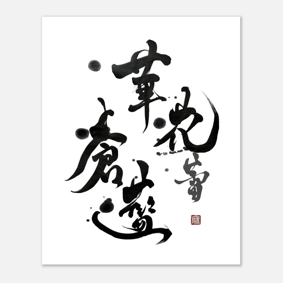
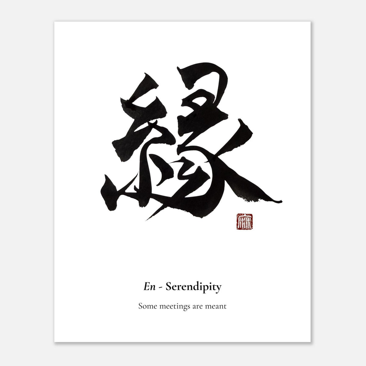
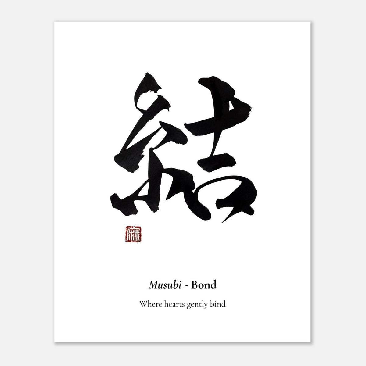
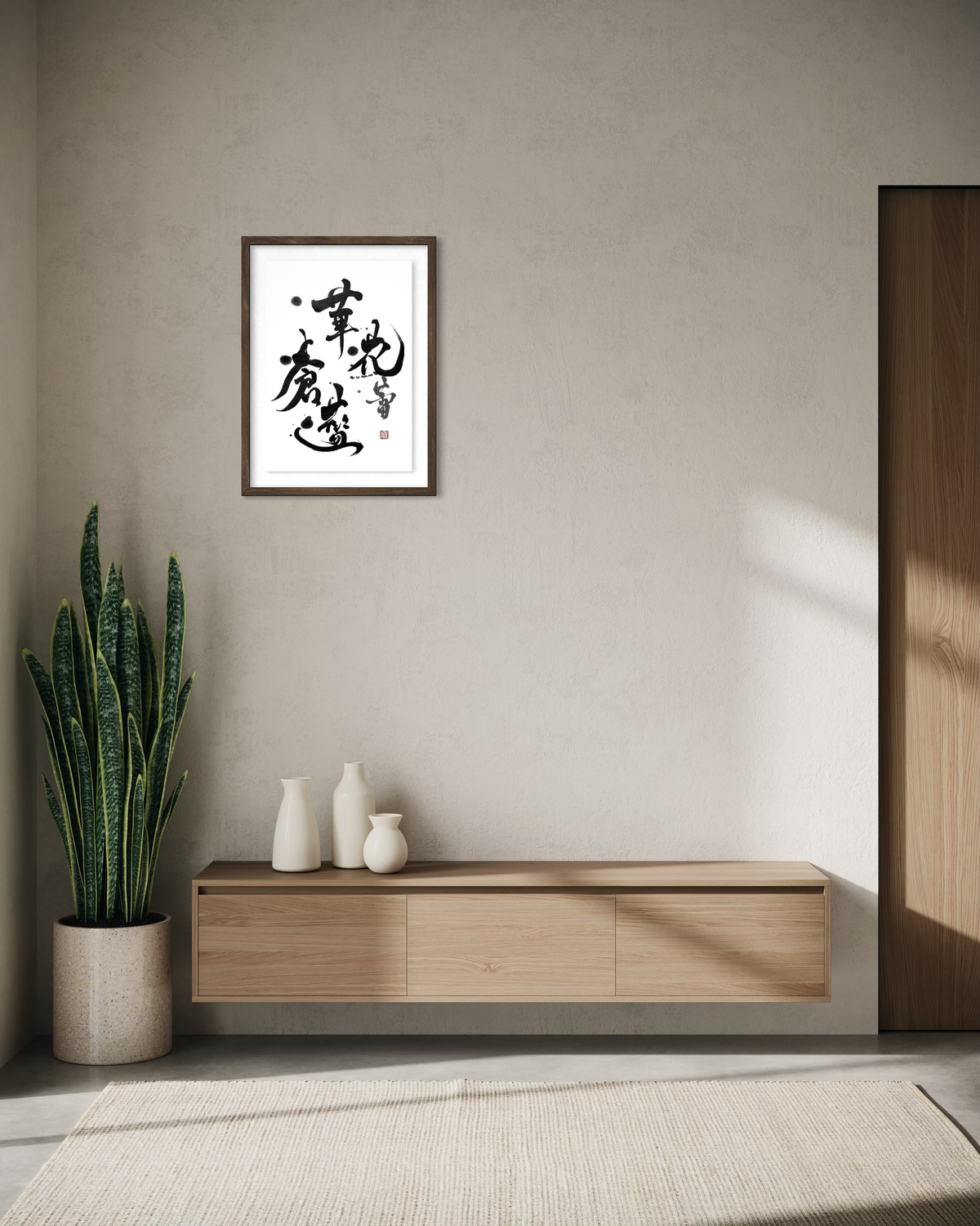
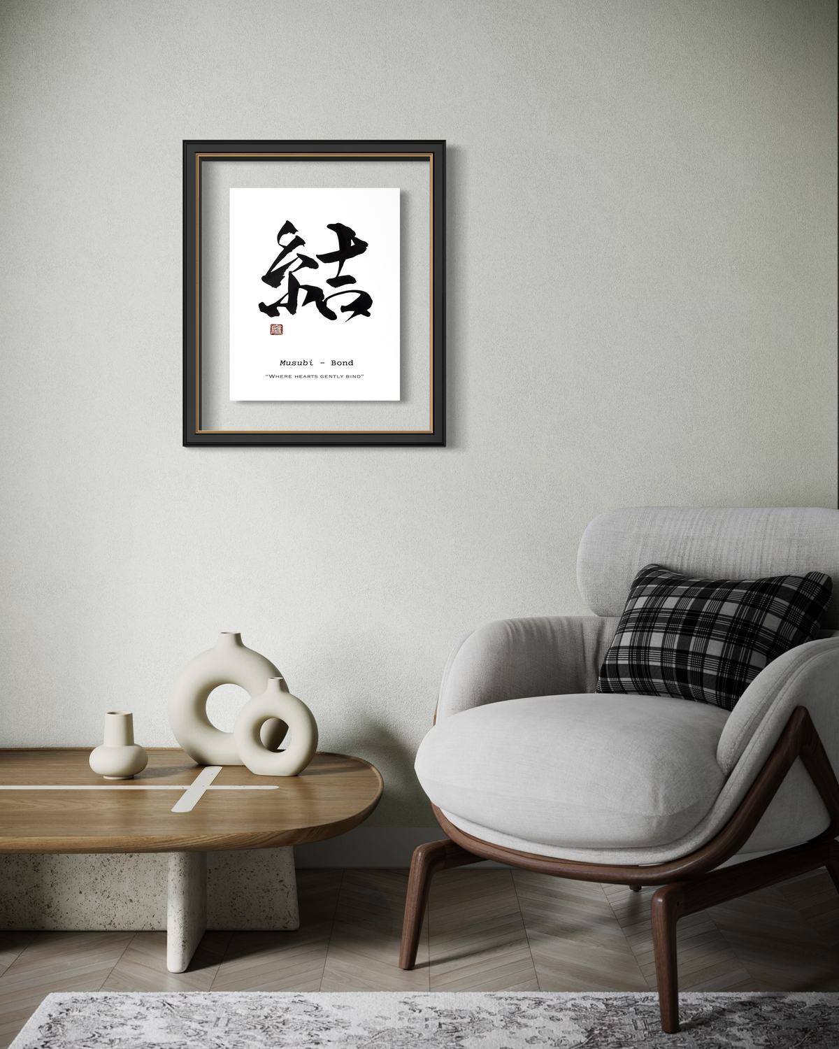
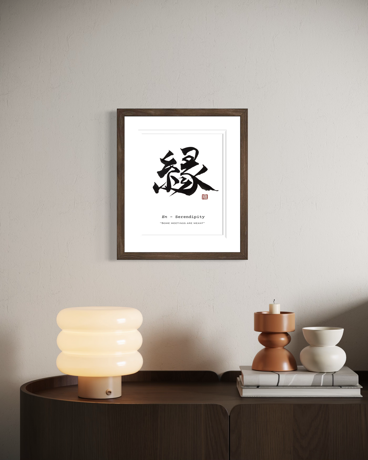
Every Japandi gallery wall needs a quiet focal point. Japanese calligraphy works beautifully because the brushwork naturally draws the eye while maintaining softness.
How to choose your anchor piece:
- Select one meaningful kanji
- Prefer black ink on white or warm paper
- Avoid overly decorative fonts
- Choose slightly larger than surrounding pieces
Popular Japandi-friendly characters:
- 夢 (dream)
- 愛 (love)
- 希 (hope)
Your anchor should feel calm but intentional — never loud.
Step 2: Keep the Color Palette Restrained
Japandi styling depends heavily on tonal discipline. Too many colors will immediately break the look.
Best palette for gallery walls:
- soft white
- warm beige
- charcoal or black
- muted taupe
- natural wood tones
Avoid:
- bright accent colors
- heavy contrast frames
- overly saturated prints
- glossy finishes
Consistency creates the signature Japandi calm.
Step 3: Choose Cohesive Frame Styles
Frames matter more than most people realize. In Japandi interiors, frame inconsistency quickly creates visual noise.
Best frame choices:
- light natural wood
- soft oak
- matte black (used sparingly)
- thin profile frames
Spacing rule:
Keep equal spacing (2-3 inches; 5-7 cm) between pieces to maintain breathing room.
Step 4: Plan Your Layout Before Hanging
Never hang pieces one by one. Japandi walls look effortless because they are carefully planned.
Easy layout method
- Place your anchor piece first
- Build outward asymmetrically
- Maintain visual weight balance
- Step back and adjust before hanging
- Keep outer edges loosely aligned
Pro tip:
Tape paper templates on the wall first — this prevents unnecessary holes.
Step 5: Embrace Negative Space
This is where many gallery walls go wrong.
Japandi is heavily influenced by ma (間) — the Japanese concept of intentional empty space. Your wall should feel breathable.
Good rule:
If it feels slightly too sparse, it is probably just right.
Step 6: Style the Surrounding Area
A Japandi gallery wall does not exist in isolation. The furniture and styling below it complete the look.
Best pairings:
- low-profile neutral sofa
- linen or cotton textiles
- ceramic vessels
- light wood console
- soft ambient lighting
Keep decor minimal so the calligraphy remains the quiet focal point.
Common Mistakes to Avoid
Even beautiful pieces can look off if the composition is wrong.
Avoid these pitfalls:
X overcrowding the wall
X mixing too many frame finishes
X choosing art that is too small
X uneven spacing
X overly busy typography instead of true brushwork
Japandi rewards restraint.
A well-composed Japandi gallery wall is less about decoration and more about intention. When anchored with meaningful Japanese calligraphy, the wall becomes a quiet expression of balance, simplicity, and modern living.
Start with one strong piece, maintain tonal discipline, and allow negative space to do its work. The result is a living space that feels calm, curated, and quietly refined.
Discover calligraphy pieces designed for modern Japandi spaces.